Updates since January 2026:
Comparison page changes
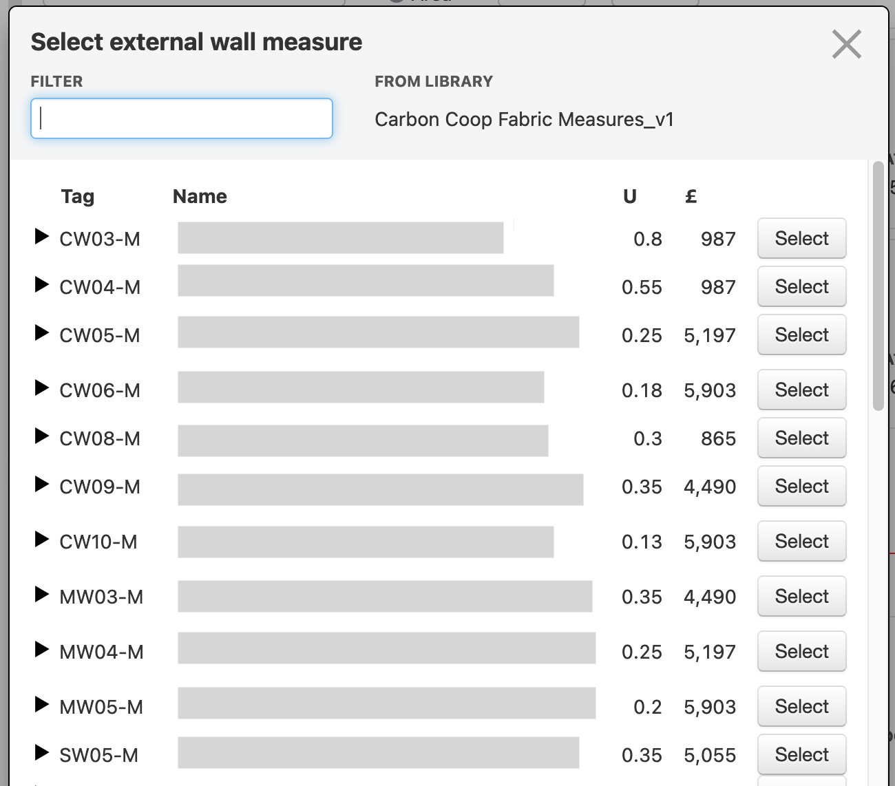
The comparison page no longer has the extended per-scenario comparisons with their ancestor scenario, but does have new tables comparing fabric elements and radiators across all scenarios. We will look into adding the graphs from the report in here later in the year.
Completed rewrite
The part of HRP that runs in the web browser is now entirely written in a different programming language than it was five years ago! It's been a long transition but along the way we have delivered a lot of reliability and usability improvements. The last piece of this went live around late March and some of our users bumped into problems caused by this last piece of the transition, but they're all ironed out now - we appreciate your patience.
We've also continued work since then to modernise the code and the way we store data. We had to keep the new code working with the old code and this meant not improving a lot of things that would break compatibility; but now there is no old code, so we can clean up a lot of things. Again, this isn't visible to users - but it does get things to a place where we can make larger-scale changes and be sure we're not breaking anything.
Minor changes
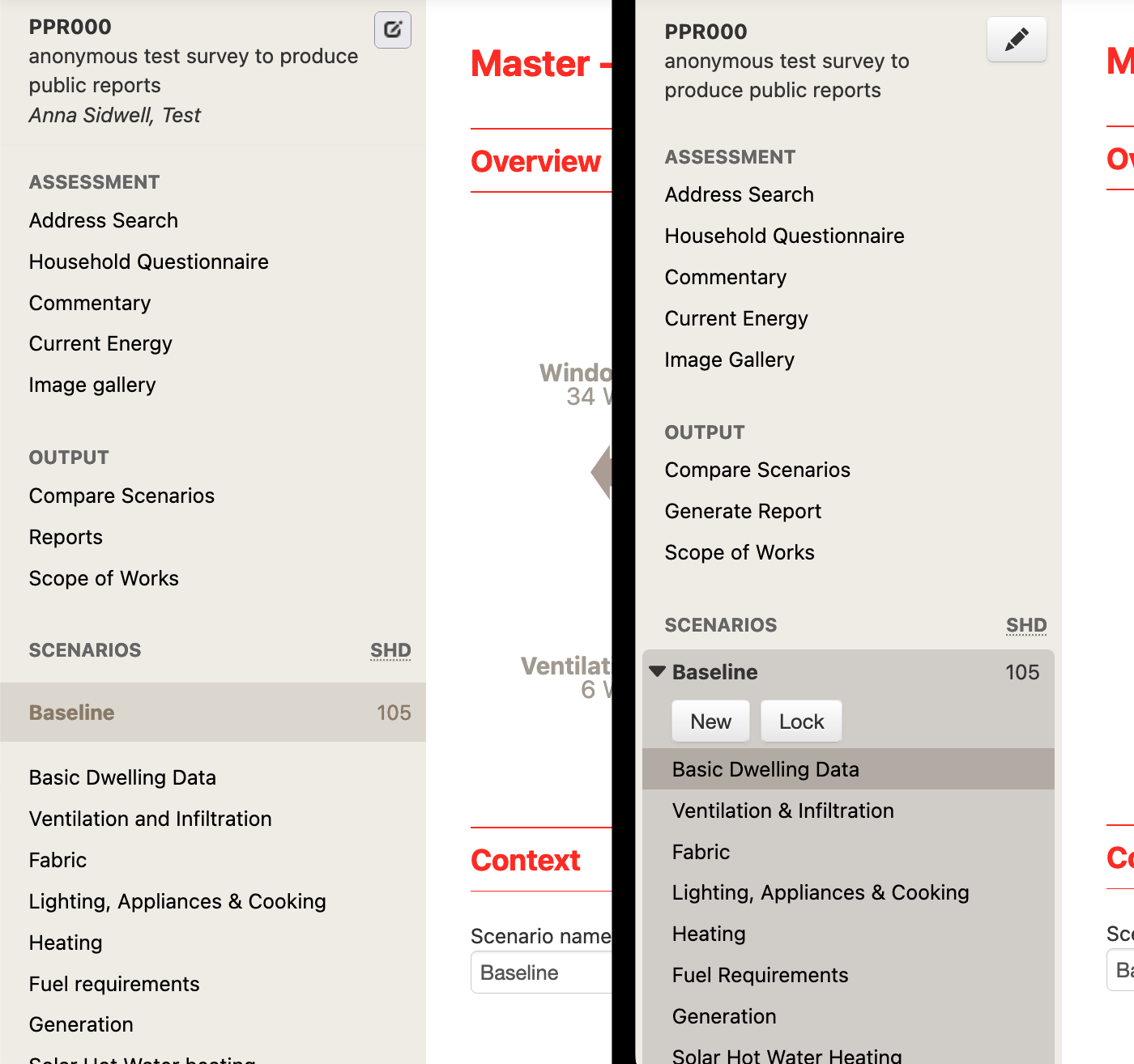
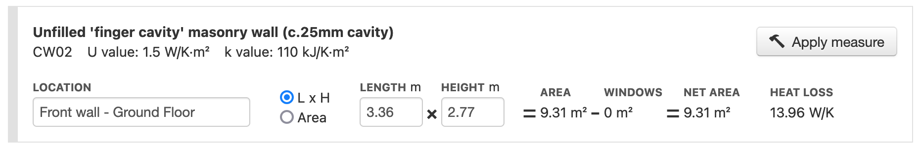
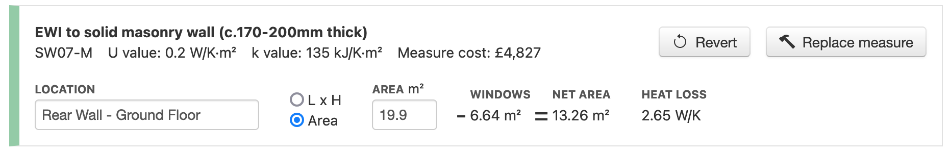
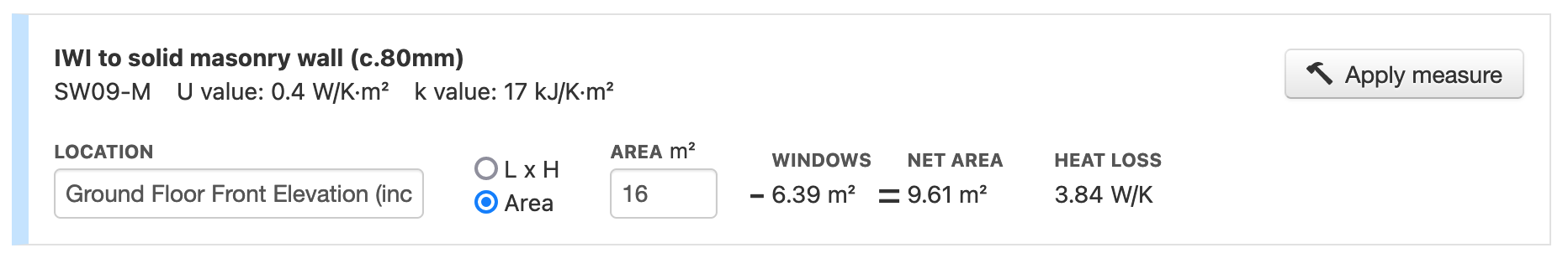
- Added per-section heat loss totals on fabric page
- Subdivide 'subtract from' dropdown on fabric page by element type
- Make all fields readonly when scenario is locked or assessment is marked complete
- Include a notice at top of page when there is a lock in place & remove error messages when navigating around an assessment when it's marked as 'Complete'
- Improvement in page load times (there's less to load since the rewrite finished, and we've also set things up so that the 1.5MB library file is only downloaded when it's changed rather than every load)
- Updated fuel costs (apr 2026)
As usual, if you have any queries, questions or complaints, please reach out to us on support@retrofitplanner.app.